Mindful Mending: A Journey of Healing and Connection
- jessicamaesample
- Jul 9, 2025
- 3 min read
Updated: Mar 3
Overview
Mindful Mending is a therapy practice that supports clients of all ages—children, teens, and adults. It offers a safe and welcoming space for growth, resilience, and self-discovery. Specializing in EMDR (Eye Movement Desensitization and Reprocessing), their approach is warm, evidence-based, and deeply human. Our goal was to create a brand and website that reflect these values: compassionate, approachable, and grounded in healing.


Brand Strategy
Mindful Mending needed an identity that could resonate with both children and adults. The brand had to invite trust while maintaining professionalism. We aimed for a cozy and artistic feel, yet clear and credible. Instead of leaning into the clinical or corporate, we focused on emotional resonance. The goal was to create a brand that feels personal, crafted, and calming.
The visual direction draws inspiration from nature, transformation, and tactile creativity. These elements echo the therapeutic process itself. Forest textures, textiles, and arts-and-crafts sensibilities shaped the moodboard. The result is a brand that balances softness with structure, whimsy with wisdom.


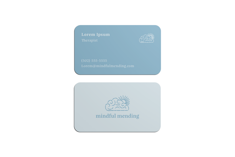
Logo Design
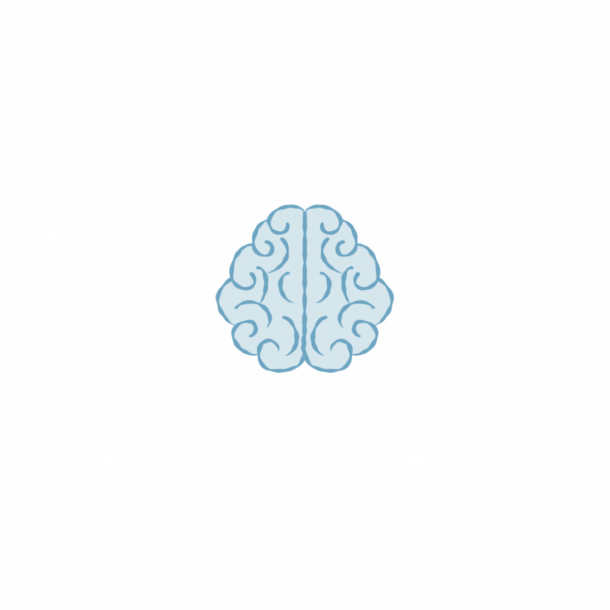
The logo icon originated from a simple yet powerful idea: combining a brain and an eye—a nod to EMDR therapy. The swirling linework reflects both neural pathways and the rhythmic eye movements used in EMDR. This symbolizes the connection between memory, emotion, and healing.
As the concept evolved, the shape began to resemble a cloud. This added softness and a sense of calm. This transformation from “brain” to “cloud” visually mirrors the client journey: from tension to release, from storm to clarity.
The result is a mark that holds complexity and compassion—just like the work Mindful Mending does every day.

Typography
We paired Elgraine and Libra for a typography system that’s both elegant and friendly. Elgraine adds structure and sophistication to headlines. Meanwhile, Libra brings warmth and openness to body copy. This combination is perfect for sensitive topics and accessible communication.

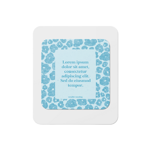
Color Palette
The color palette features soft blues, greens, and neutral tones. These colors have organic names and subtle contrast. The hues are calming enough for therapy spaces, vibrant enough for kid-friendly materials, and grounded enough for use across digital and print.


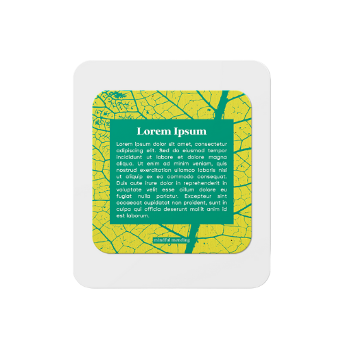
Graphic Elements
We developed a modular design system made up of:
Hand-drawn botanical illustrations and natural motifs
Organic patterns and tactile-inspired icons
Subtle textures and overlays evoking handcrafted work


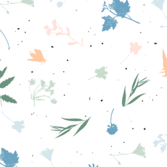


These assets support a visual identity that feels layered, flexible, and rooted in care. We also curated a collection of public domain paintings and nature photography to use across materials. This brings warmth, richness, and accessibility to the overall aesthetic.
Website Design
The website was designed to carry this identity forward. It is clean, calming, and easy to navigate for clients at every age and stage. Sections are organized to help visitors quickly find therapists, services, and answers. Subtle animations, earthy tones, and visual continuity help build a sense of safety and trust.
On the home page, we applied these brand elements to guide the user’s emotional experience from the start. The swirling logo animation introduces the brand’s core symbolism and soft motion. Layered textures and botanical graphics echo the handcrafted visual language. Earth-toned color blocks organize the content, keeping the layout friendly and digestible.
Paired with intentional typography and welcoming messaging, the homepage sets a tone that feels gentle, clear, and human—just like the therapy experience Mindful Mending offers.

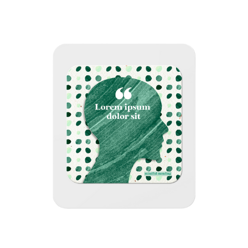

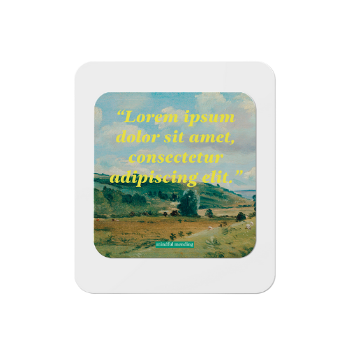


We also delivered branded social media templates and sample layouts for event announcements, quote graphics, and therapist spotlights. This makes it simple for the team to maintain a cohesive presence online.


Outcome
This project was a joy to bring to life. The visual identity strikes a balance between symbolism and softness. It helps therapy feel more approachable from the very first impression. Whether you encounter Mindful Mending through their website, on social media, or inside their practice, the brand reflects what they offer their clients: connection, creativity, and healing.

Comments