Greetings from Robert Todd Branding & Email Design
- jessicamaesample
- Jul 10, 2025
- 2 min read

Overview
Robert Todd, a world-renowned bridge teacher and President of the ACBL Educational Foundation, needed a fresh and engaging brand identity and email design to support his extensive teaching and seminar schedule. Known for his global travel and vibrant teaching style, Robert's brand required an aesthetic that captured his adventurous spirit and expert approach to bridge education.
This branding and email campaign not only reflect my skills in visual storytelling and brand identity creation but also showcase my ability to blend thematic design with clear, actionable communication.
Design Strategy
Given Robert's international travels and active seminar schedule, we opted for a vintage travel postcard aesthetic. This approach not only communicates the excitement and adventure of his educational tours but also introduces warmth and nostalgia, immediately creating a welcoming and engaging atmosphere for his audience.
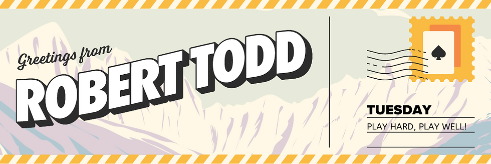
Logo & Visual Identity
The logo design embraces a classic, handcrafted look reminiscent of vintage postcards and travel memorabilia. Typography with a retro feel was paired with illustrations and subtle textures to evoke the charm of old-world travel, instantly recognizable and memorable for Robert's diverse global audience.
Typography
The selected typefaces strike a balance between professional readability and playful, nostalgic appeal. A handcrafted serif font serves as the main heading and display font, adding personality and warmth. It is complemented by a clean geometric sans-serif for body text, ensuring clarity and easy reading in both digital and print formats.
Color Palette
We curated a warm, inviting palette featuring soft earthy tones and rich vintage colors, echoing the hues found in classic travel postcards. This palette not only resonates with the travel theme but also reinforces a sense of approachability and comfort, essential for an educational brand.

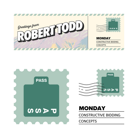


Email Design
The daily emails are structured around clearly defined themes to ensure a well-rounded educational experience each week. Each email uses visual consistency while differentiating through distinct vintage postcard-style headers and icons, tailored to represent the topic of the day:
Mondays: Constructive Bidding Concepts
Tuesdays: Play Hard, Play Well!
Wednesdays: Competitive Bridge Battles
Thursdays: Dedicated to Defense
Fridays: Classroom Challenges
Saturdays: Reasoning with Robert
Sundays: Guest Spotlights (featuring Eddie Kantar + Marti Ronemus)

Custom Graphics
Custom illustrations and textures from vintage-inspired vector packs were used to create dynamic headers and supportive visual elements throughout the emails. These visuals effectively evoke the golden age of travel, connecting emotionally with the audience while clearly organizing content for ease of navigation.
Outcome
The cohesive branding and thoughtfully designed email templates significantly elevated Robert Todd's professional presence, increasing subscriber engagement and retention. The approachable yet polished visuals encourage ongoing interaction and reinforce Robert’s reputation as a world-class educator and bridge ambassador.
By strategically combining nostalgic visuals with modern functionality, the brand now reflects Robert Todd’s unique teaching style and global reach, creating excitement around every lesson.


Comments