Buck Hill Farm Logo
- jessicamaesample
- Jul 10, 2025
- 2 min read

Overview
Buck Hill Farm, a family-run greenhouse farm in New Jersey, sought a logo that visually embodied its core values: sustainability, community, and quality produce grown with care. The challenge was to craft a brand identity that resonated with their diverse customer base, from CSA families to local event-goers, while celebrating the farm’s vibrant, hands-on ethos.
Brand Strategy
The design strategy revolved around embracing Buck Hill Farm’s unique, "funky" personality—distinctly different from typical delicate farm branding. Extensive research into similar market players highlighted opportunities to stand out through authentic, approachable visuals. Central themes of community engagement, sustainable agriculture practices, and hands-on farming guided the creative direction, ensuring the brand connected deeply with the local community and prospective customers.

Design Process
The design process began by exploring motifs reflecting both sustainability and community. Iterations included various representations of greenhouses, vegetables, and subtle antler imagery inspired by the farm's location on a nature preserve named Buck Hill. Feedback from the client emphasized authenticity, warmth, and approachability, shaping the direction towards a handcrafted aesthetic paired with clear, professional typography.


Final Logo
The resulting logo features a clean, structured greenhouse icon as its centerpiece, directly symbolizing Buck Hill Farm’s dedication to sustainable, greenhouse-based agriculture. The addition of slightly curved, hand-drawn typography introduces warmth and friendliness, capturing the farm’s welcoming atmosphere and hands-on approach. Subtle antler elements, integrated into alternative variations, pay homage to the farm’s namesake without dominating the design.
Typography
Typography choices balanced readability with a playful yet grounded aesthetic. The hand-drawn lettering was selected for its ability to convey a sense of personal touch and authenticity, integral to Buck Hill Farm’s identity. Paired with more structured fonts, this approach ensured clear communication across diverse applications, from signage to promotional materials.
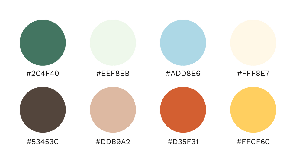
Color Palette
The color palette incorporates earthy greens and warm neutrals, directly referencing the farm's organic produce and commitment to environmental responsibility. These hues not only reinforce the brand’s values but also enhance the visual connection to nature, evoking feelings of freshness and vitality.
Applications and Mockups
Mockups illustrated how the logo and brand elements functioned cohesively across various touchpoints—such as tote bags, apparel, event signage, and packaging. Each application underscored the practical versatility of the logo and demonstrated its adaptability to both professional and informal contexts, maintaining brand consistency throughout.


Outcome
The final Buck Hill Farm brand identity effectively communicates the farm’s values of sustainability, community, and quality. By capturing the authentic, hands-on spirit of the farm through thoughtful, handcrafted design elements, the logo has resonated strongly with the farm’s target audiences, establishing a memorable, approachable, and engaging visual presence.


Comments