Kindred Minds Brand Identity + Website Design
- jessicamaesample
- Feb 27
- 2 min read

Overview
Kindred Minds is an affirming, trauma-informed mental health practice supporting neurodivergent and LGBTQ+ individuals, families, and caregivers.
The vision is simple: to create a space where people feel understood before they feel evaluated.


Many clients arrive feeling overstimulated, guarded, or wary of traditional systems. My goal was to create a cohesive visual identity that communicates safety, professionalism, and warmth.
Brand Strategy
Kindred Minds is grounded in five core values: autonomy, curiosity, justice, community, and authenticity. The goal was to translate those values into a visual language. Soft forms, comforting colors, and sublte textures work together to lower emotional friction and create an atmosphere of comfort and acceptance.

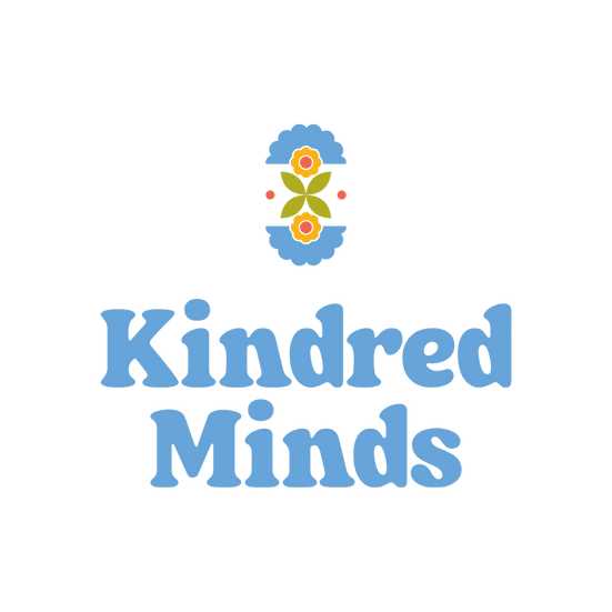
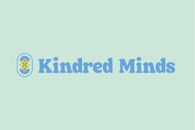
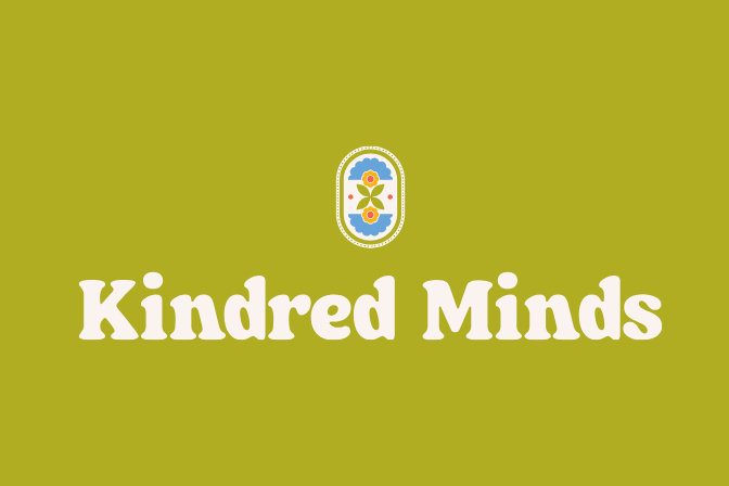
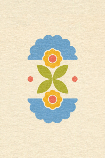
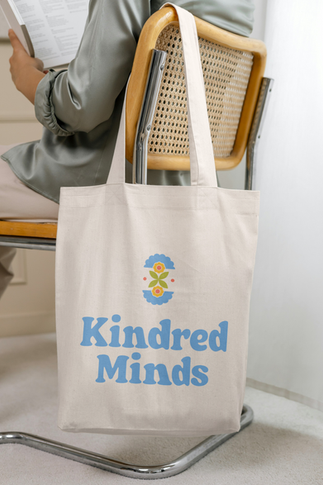
Logo Suite
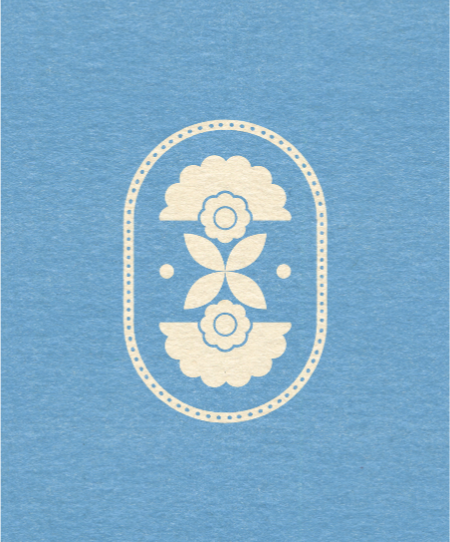
The logo suite balances structure with softness, pairing a character-driven wordmark with a simple, folk-inspired floral icon. The icon reflects care and growth without relying on literal symbolism.


The system includes:
Primary and secondary logos
Wordmark for editorial and photography-heavy use
con mark for small-scale applications
Badge variation for community-facing materials
Each version maintains clarity while adapting across various applications.
Typography
The type system pairs Fraunces and Source Sans 3.
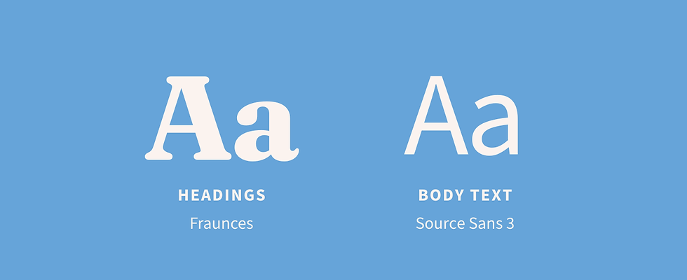
Fraunces brings character and subtle nostalgia to headlines. It's familiar and friendly without feeling decorative or childish. Source Sans 3 ensures accessibility and calm readability in longer-form content. Together, they create a steady visual rhythm.
Color + Visual Language
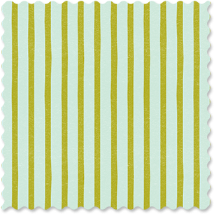
The color system draws inspiration from retro textiles and risograph inks, creating a warm, tactile foundation. Grounded tones like Bottle Green and Indigo Press anchor the brand, while Cornflower and Avocado introduce softness and reassurance. Accent colors are used sparingly to add warmth without urgency.

Custom gradients were developed from the core palette, layered softly to create warmth and subtle movement without distraction.


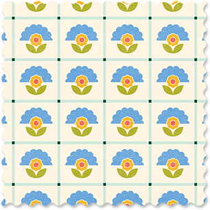
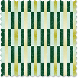
Custom patterns draw from folk-inspired motifs and geometric repetition, allowing the brand to scale across print and digital with consistency.


Subtle print texture is used deliberately reinforcing the handcrafted, personal nature of the brand.
Icons + Graphics
A layered graphic system brings personality and cohesion to the brand.
Florals draw from folk-inspired forms and softened geometry, echoing the logo mark while allowing for variation in scale and composition.

Custom Care Icons were designed to gently signal services and areas of support. Their rounded forms and minimal detailing keep them approachable and clear, reinforcing the brand’s calm tone.

Values Icons translate the practice’s core principles — autonomy, curiosity, justice, community, and authenticity — into simple visual symbols.

Framing Elements provide structure across layouts. The soft borders allow text heavy content to feel clean, calm, and intentional rather than crowded.
Together, these graphic components create a flexible and expressive visual language.
Website Design
All design decisions for the website prioritized clarity and ease, helping visitors quickly find care information without overwhelm.

Generous negative space, soft florals, and a consistent typographic hierarchy reduce cognitive load, while restrained color and steady spacing support intuitive navigation.
Text-heavy pages — including services and FAQs — are framed to keep information approachable rather than clinical. The result is a structured yet breathable digital environment.
Outcome
The identity extends across web, signage, social media, printed materials, and branded objects. Composition emphasizes negative space, hierarchy, and restraint.
Kindred Minds presents a cohesive, emotionally intelligent brand that reflects its values at every touchpoint.


Comments