Trailhouse Brand Identity + Website Design
- jessicamaesample
- Jul 9, 2025
- 3 min read
Community-rooted, affirming therapy for children and teens

Overview
Trailhouse is the first neurodiversity-affirming therapy and play center in Louisville, supporting Autistic, ADHD, and neurodivergent children and teens. The practice offers a holistic, strengths-based approach that values connection, collaboration, and societal inclusion. Located on a wooded acre with a private walking trail, Trailhouse needed a visual identity and website that felt equally personal and professional—engaging for kids, appealing to teens, and reassuring for caregivers.
I led the brand identity and website design to bring that vision to life, crafting a warm, inclusive, and handcrafted aesthetic rooted in nature and community.
Brand Strategy
The goal was to design a cohesive visual system that balances playfulness with polish—communicating both the credibility of a mental health practice and the imaginative spirit of childhood. Strategy priorities included:
Creating a welcoming and inclusive visual language that appeals to children, teens, and adults alike
Reflecting the natural setting and values of connection, growth, and acceptance
Standing out in a field where many therapy brands feel sterile or clinical
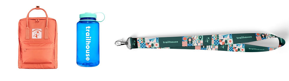
Supporting flexible use across signage, worksheets, social media, and merchandise

The brand tone is nurturing and empowering—gently authoritative, inclusive, and human. We aimed to create a space (visually and emotionally) where neurodivergent children and their families feel seen, supported, and celebrated.

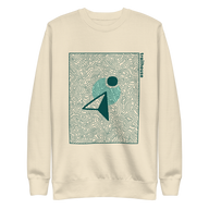
Logo
The Trailhouse logo system is playful, modern, and highly adaptable. The primary logo combines a rounded type treatment with a symbolic icon: a moon orbiting a triangle—evoking a trail marker, play button, or directional sign. This shape-centered system represents progress, connection, and safe exploration.
The logo suite includes:
Primary Logo (with wordmark and icon)
Secondary and Rounded Logos for smaller or more casual applications
Icon and Text-only Logos for tight spaces or simplified contexts

Each variation is designed to maintain legibility and brand integrity across use cases.
Typography
The type system pairs two fonts:
BD Supper (bold and regular) for headings — playful yet structured
Montserrat (light and regular) for subheadings and body text — clean and legible

This combo strikes a balance between youthful and grown-up, playful and professional. Lowercase styling adds approachability, while title case brings polish to section headers.
Color Palette
Inspired by forest trails, blue skies, and sunrise warmth, the primary palette includes:
Enchanted Forest & Ripple (deep to pale shades of green)
Frost & Neptune (soft to bold blues)
Ember & Petal (sunset oranges and pinks)

Color pairings were intentionally defined to maintain visual harmony and avoid mismatched combinations, especially within logo use.
Graphics/Patterns/Texture
The brand includes a full suite of custom icons and patterns:
Nature, trail, and STEM icons support signage, digital tools, and educational resources
Seamless patterns (including a multicolored gingham and abstract trails) are designed for tiling across backgrounds, handouts, and branded materials
Risograph textures add depth and tactile charm, nodding to handcrafted methods and retro printmaking


These elements combine geometric simplicity with warmth and personality, ensuring every asset feels human, engaging, and on-brand.
Website Design
The Trailhouse website brings the full brand system to life through thoughtful layout, interactive features, and rich storytelling. Key design considerations included:
Homepage experience that mirrors a journey into nature—grounded in warmth, movement, and visual clarity
Color pairings used with intention to create emotional pacing and visual hierarchy across sections
Illustrated icons to guide visitors and reinforce core brand values without overwhelming the page
Typography system applied consistently for readability, structure, and tone
Texture and pattern used sparingly to add dimension while keeping the site clean and accessible
The site is fully responsive and designed to be as calming and affirming as the physical Trailhouse space. Calls to action guide families to book consultations, explore services, and engage with community offerings.
Outcome
The final brand and website successfully deliver on the mission: creating an inclusive, imaginative, and deeply supportive visual world that meets children where they are—and gives caregivers the confidence that their family is in thoughtful, capable hands.

Trailhouse now has a robust visual foundation to grow from, with cohesive tools to support in-person experiences, social content, educational resources, and digital outreach.


Comments