Baron Barclay Website Redesign + Brand Refresh
- jessicamaesample
- Jul 10, 2025
- 3 min read

Overview
This project involved a full-scale redesign and rebranding of Baron Barclay, a longstanding leader in the bridge supply world. As both a retailer and hub for the bridge-playing community, Baron Barclay needed a modernized brand and user-friendly website that honored its heritage while appealing to new and returning players alike.
I led the entire design process—from brand refresh and logo development to designing every page of the new website. The result is a bold, contemporary identity paired with a Shopify-based site that’s clean, intuitive, and ready to meet the evolving needs of bridge players everywhere.
This case study highlights my strengths in strategy-driven branding, user-centered web design, and collaborative problem-solving—skills I bring to every project I take on.

Brand Strategy
To reimagine the Baron Barclay brand, I started by identifying its key audiences: long-time bridge players, newer learners, and instructors or clubs looking for teaching tools and bulk orders. Through internal discussions and customer feedback, we learned users valued clarity, ease of navigation, and a sense of trust in the brand's authority.
The refreshed brand needed to:
Reflect the company’s deep roots in the bridge community
Appeal to both traditional and younger audiences
Improve usability and access to resources
Signal a modern, organized, and reliable presence
This strategic foundation informed every design decision—from logo structure to how categories were restructured for the online store.

Logo
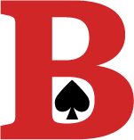
The updated logo brings a modern, simplified approach to the original identity. The new mark is clean, bold, and instantly recognizable at any scale—designed for digital use, print, and product packaging.
Its strong letterforms signal dependability and longevity, while subtle spacing and weight adjustments create a sense of openness and approachability.
The logo was refined through internal feedback loops and testing across different product and digital applications to ensure versatility and legibility.

Typography
The typography system pairs a confident, geometric sans-serif for headers with a clean, readable font for body text. This approach strikes a balance between authority and friendliness—ideal for a brand that spans beginner instruction and serious tournament materials.
Clear hierarchy and ample spacing enhance usability across product descriptions, articles, and mobile interfaces.
Typography also plays a key role in navigation clarity, particularly in long-form content such as bridge book previews and strategy guides.

Color Palette
The refreshed palette is bolder and more modern than its predecessor, with deep navy, warm taupe, and a bright red accent that adds energy and focus.
This new scheme helps the site feel visually consistent and vibrant without overwhelming users. Key colors guide attention to CTAs and navigation while reinforcing the brand’s updated personality: timeless, bold, and customer-first.
Color was also a key accessibility consideration—tested across backgrounds and product thumbnails for optimal contrast and readability.
Website Design
The website redesign is where the new brand truly comes to life.
Key UX improvements include:
Streamlined navigation: Consolidated categories and new filtering options make product discovery more intuitive.
Improved search functionality: Smarter search suggestions and visible filters allow users to find what they need faster.
ACBL member discount flow: Users can now enter their ACBL number to apply discounts—no account required.
Shopify transition: I collaborated with a team member on backend logistics including product transfers, pricing, bundles, and discount systems.
Every page—from the homepage to blog articles to checkout—was designed with clarity, trust, and ease-of-use in mind.
The visual system extends to mobile with full responsiveness, ensuring a seamless shopping experience across all devices.
Outcome
This project resulted in a dramatically improved user experience and a visual identity that finally matches the reputation Baron Barclay has earned over decades in the bridge world.
From branding to backend implementation, I helped create a system that’s easy for customers to use and easy for the company to manage going forward.
Key outcomes:
Reduced friction in checkout and product discovery
A modern visual identity that bridges (pun intended) tradition and innovation
Positive feedback from long-time customers and first-time visitors alike


Comments