Elmgrove Foundation Brand Identity
- jessicamaesample
- Mar 3
- 2 min read

Overview
Elmgrove Foundation is a nonprofit dedicated to increasing access to neurodiversity-affirming therapy, education, and community programs. The organization exists to move beyond compliance-based models and build systems that honor difference, foster belonging, and protect nervous system safety. Unlike traditional awareness-based nonprofits, Elmgrove centers lived experience, connection, and systemic change. The brand needed to reflect that shift.

Brand Strategy + Visual Direction
Elmgrove’s foundation rests on three core pillars:
Care. Community. Advocacy.

Elmgrove’s design direction draws from:
Field journals
Museum archives
Biodiversity documentation
Hand-kept collections

The brand blends macro nature photography with paper textures, ink marks, and hand-drawn elements to create something that feels grounded and lived-in. It avoids the overly polished healthcare aesthetic and instead embraces warmth, texture, and imperfection

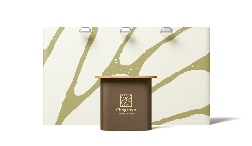
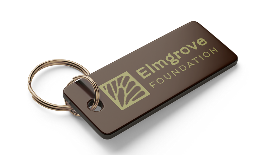
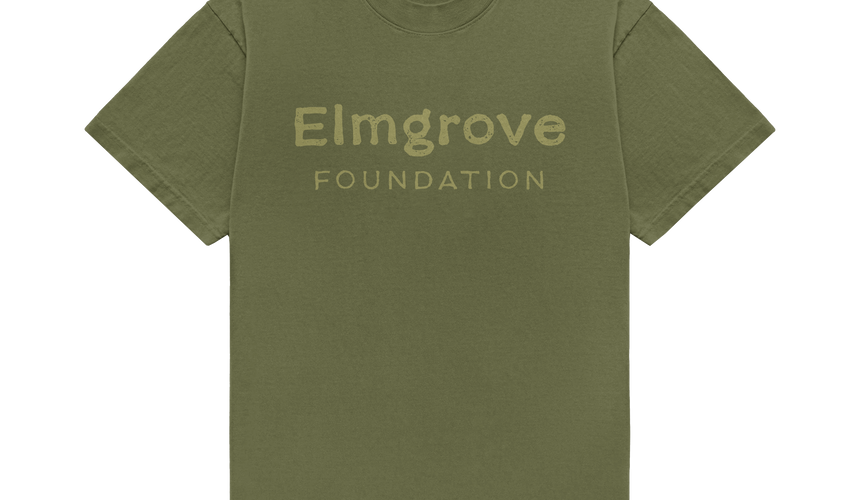
Logo System
A Flexible, Cohesive Identity
The Elmgrove logo suite was designed as a system, not a single fixed mark.
The core icon is inspired by the branching structure of a butterfly wing — referencing elm tree limbs, neural pathways, and interconnected systems.
The system includes:
Primary logo
Secondary Logo
Wordmark
Standalone Icon Mark

This flexibility allows the brand to show up confidently in formal donor materials, community events, social media, and small-scale applications.

Typography
Human Expression + Archival Structure
The type system balances warmth and order
Behind the Nineties – expressive serif for headings (editorial, reflective tone)
IBM Plex Mono – structured body text inspired by archival labeling systems
Biro Script Plus – subtle handwritten accent for human moments


Hierarchy is used gently — guiding readers without overwhelming them. Typography reduces cognitive noise and supports accessibility.
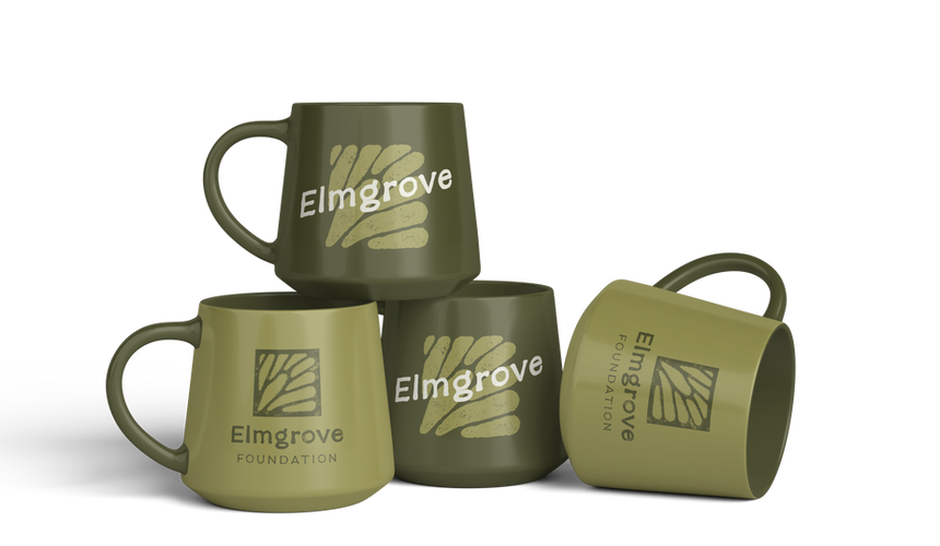
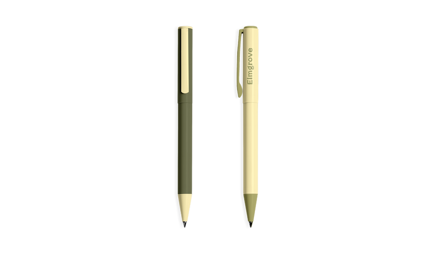
Color Palette
Grounded in the Natural World
The color system is rooted in landscapes, materials, and organisms.
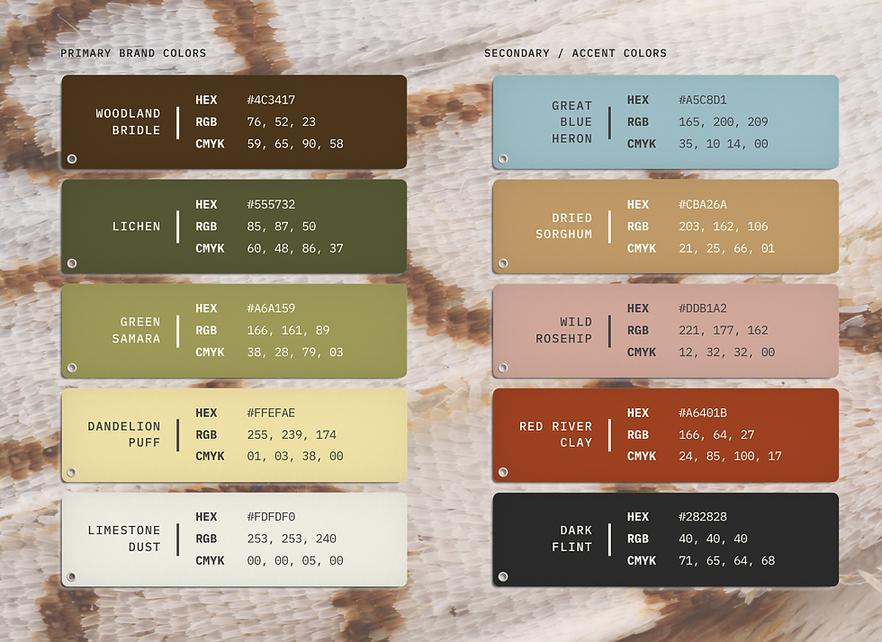
The palette feels earthy, steady, and timeless — intentionally avoiding trendy nonprofit blues and hyper-saturated tones.
Custom Iconography
Icons were designed to feel hand-drawn and observant — organic rather than geometric.

Backgrunds, Gradients, and Texture
Soft Structure
Custom gradients blend brand hues to create atmospheric, nature-inspired transitions.
Background Textures draw from:
Aged Paper
Felt
Wood Grain
Archival Book Covers
Stone
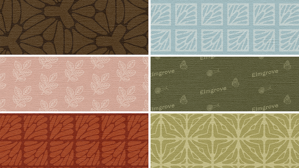
Patterns extend the branching motif in subtle, rhythmic ways — suggesting connection without literal illustration
Curated Image Library
Biodiversity as Metaphor
The curated image library includes:
Macro nature photography (butterfly wings, mushroom gills, moss, reptile skin, seashells).
Public domain illustrations from the Biodiversity Heritage Library.

The macro photography emphasizes variation, texture, and interconnected systems — visually reinforcing the belief that difference is natural and essential.
The archival illustrations echo curiosity over correction.

Results
Elmgrove Foundation now has a flexible, scalable brand system designed to grow alongside its mission.